UX & UI Design + Art Direction
UX & UI Design + Art Direction
In 2014, as part of a small team of creatives, I crafted UX and UI iterations during the three distinct bingiton.com redesigns. I pitched multiple UX directions to the client and worked with them to incorporate their feedback in the final flow. I later produced assets for the TV spot and the development team in China sometimes meeting late at night to ensure weekly dev sprints received timely assets.
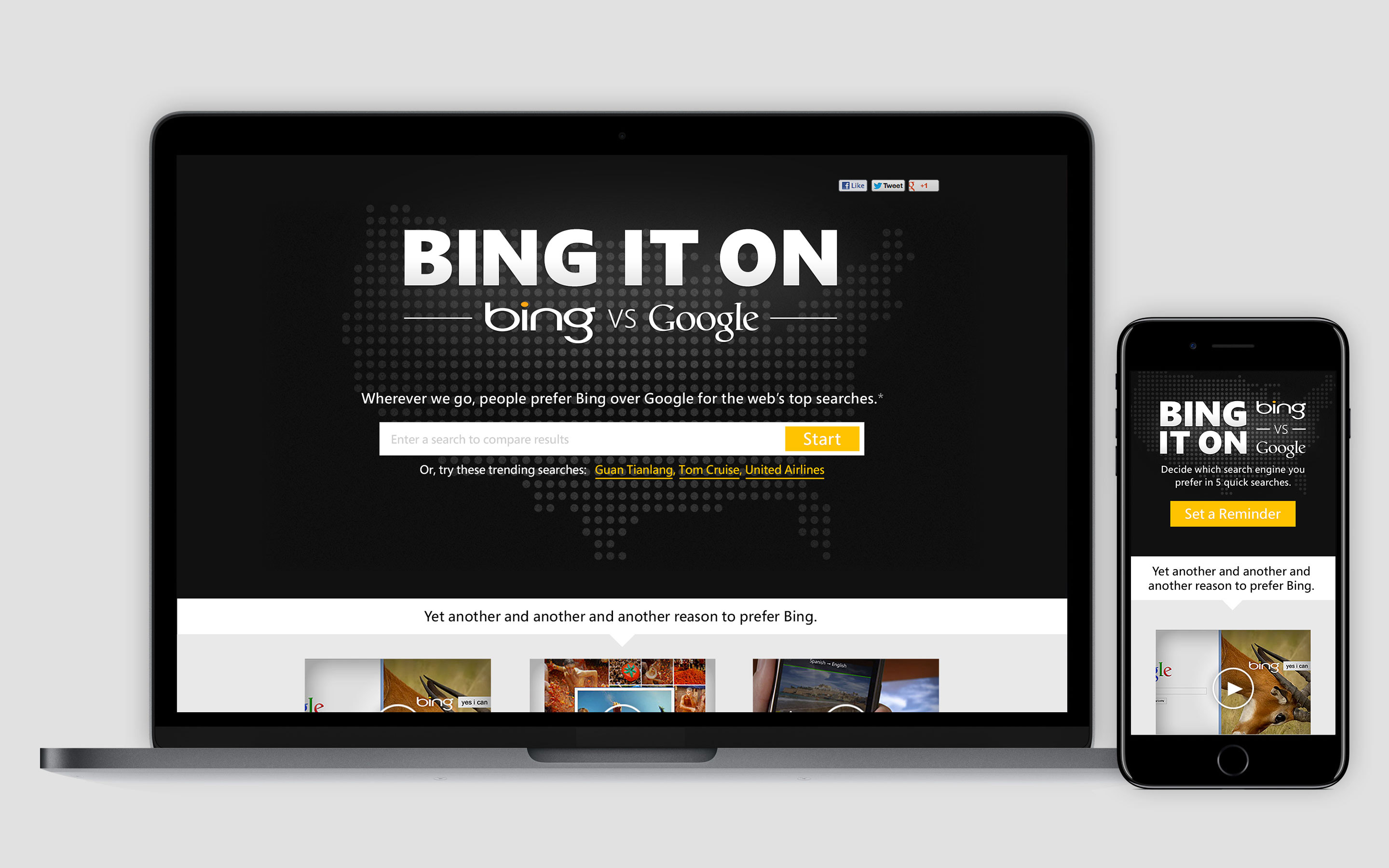
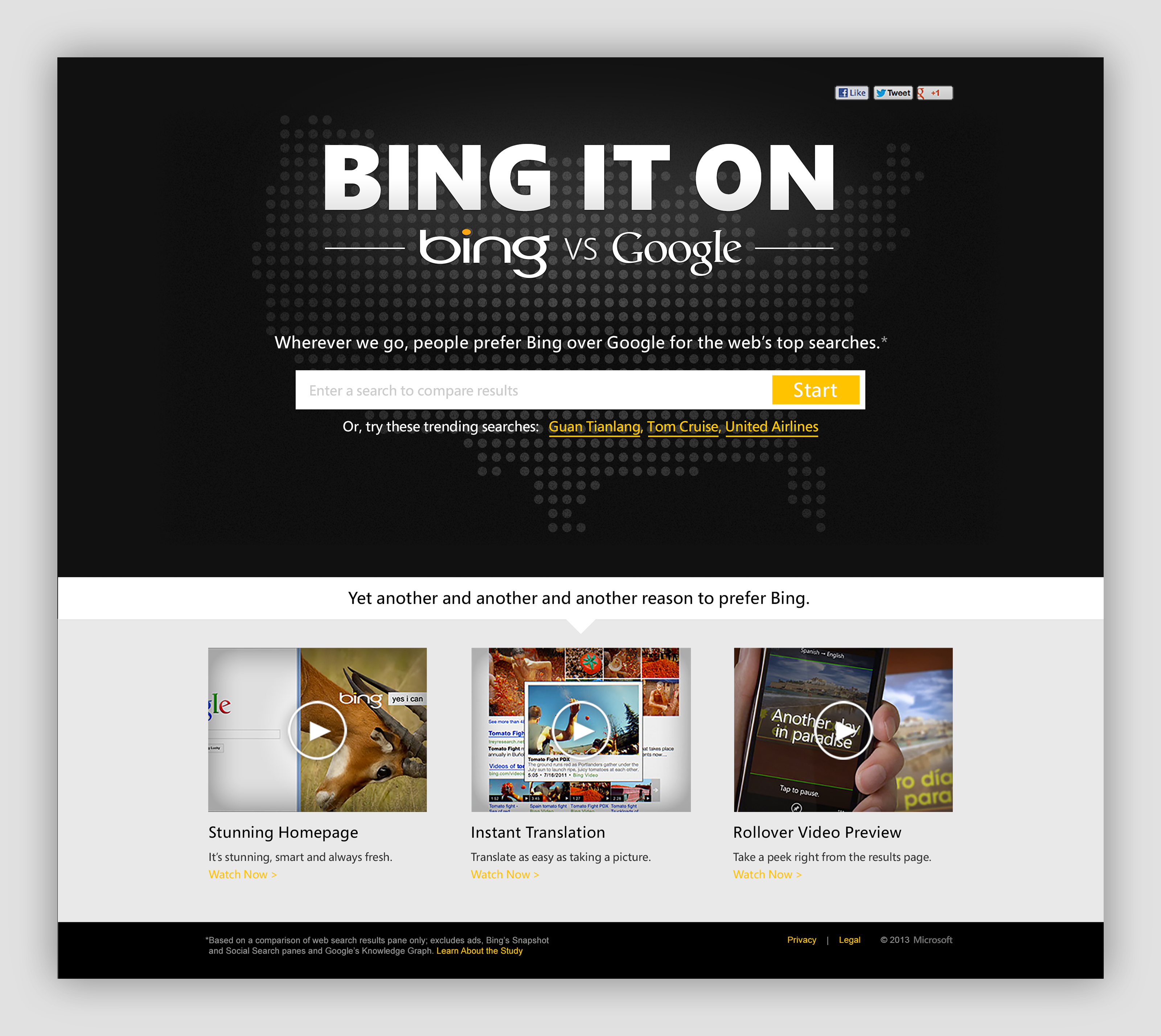
Bing craved the search engine spotlight that Google had dominated for many years prior, so in early 2014 Bing laid the groundwork for a national campaign to compare and contrast the two search engines. Utilizing a “blind taste test” style web app, and supporting TV campaigns, we set out on the daunting task of competing with a giant in the industry. When the project was handed off to our team it was only a rough prototype with a heavy-handed graphic skin. I took my UX concepts in multiple directions to show how the tool could work harder for Bing. This resonated with the clients who pitched in additional insights during following iterations. Prior to presenting my UX research client signoff was always a challenge to receive. Trusting our team at last the clients quickly fell in line with the methodology and design process I had cultivated with them and worked through the flows with our team to come to the final direction.
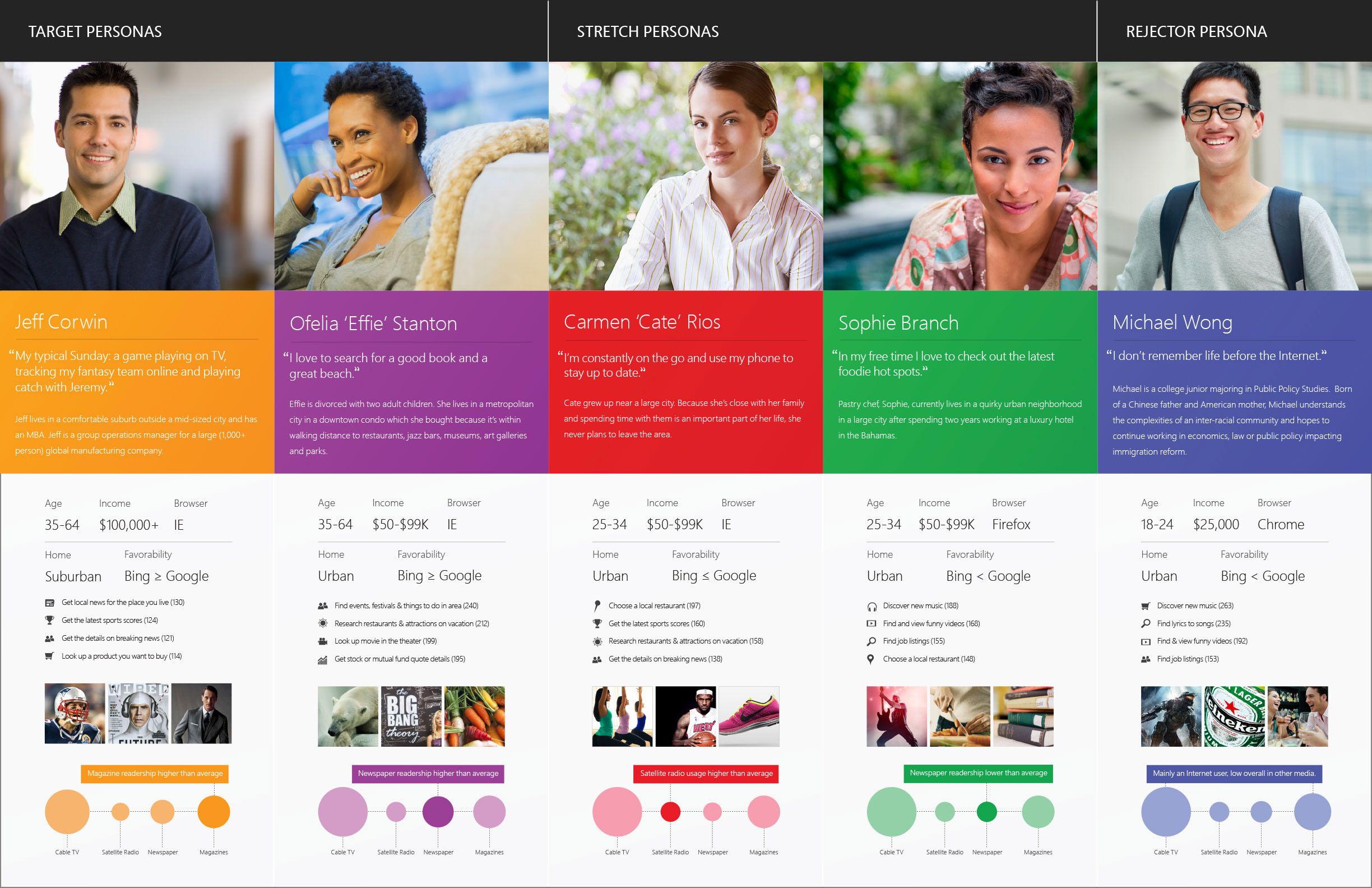
Bing provided my creative team with an independently compiled research deck that we derived some of our design direction from. This focused on items like messaging, target audience and value propositions that we used to formulate our own research efforts. We utilized established Bing global personas from a prior project I had been a part of to better inform our design’s for Bing's ideal target audience.
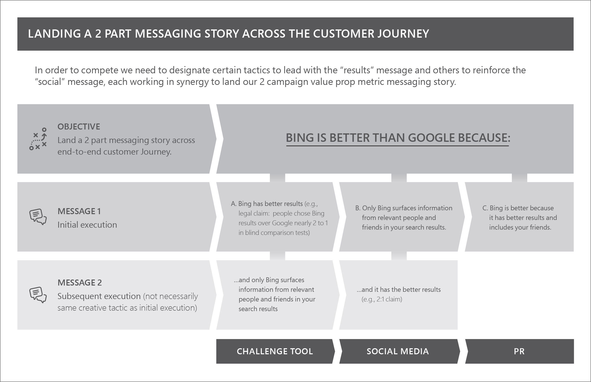
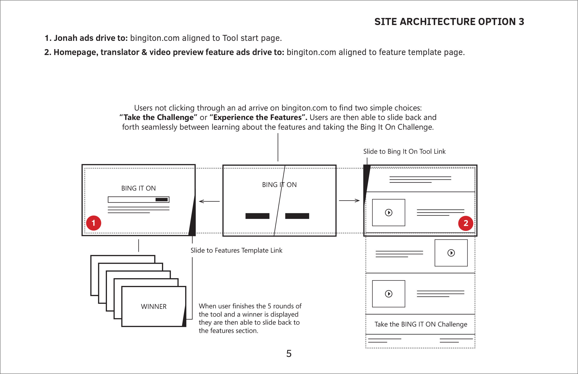
Once the copywriters had compelling approved messaging, we set forth building site architecture options. Four wireframe options were developed to help illustrate each direction fluently for the client. We all arrived at an approved hybridized version of two of the distinct directions which allowed us to start in on the UI design.
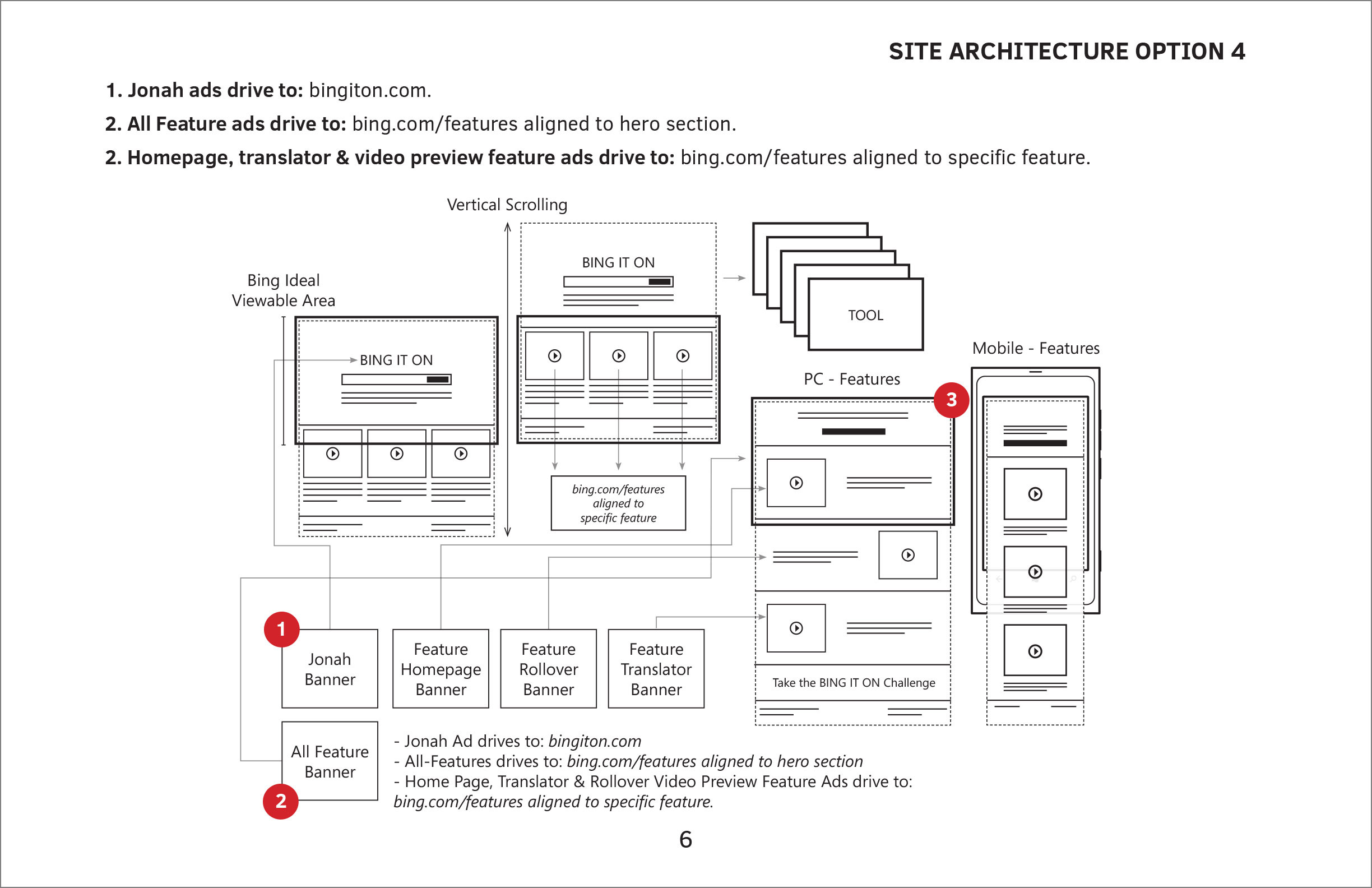
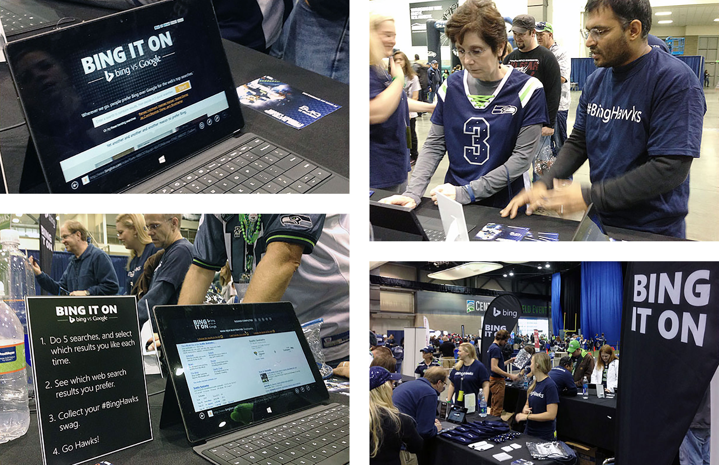
I was in charge of the UI design of the web tool as well as overseeing the production of the visual marketing efforts. This included website banner campaigns, Seattle Seahawk partnership material and stadium digital LED scrollable displays, as well as vector renditions of the UI for the TV spot animations.

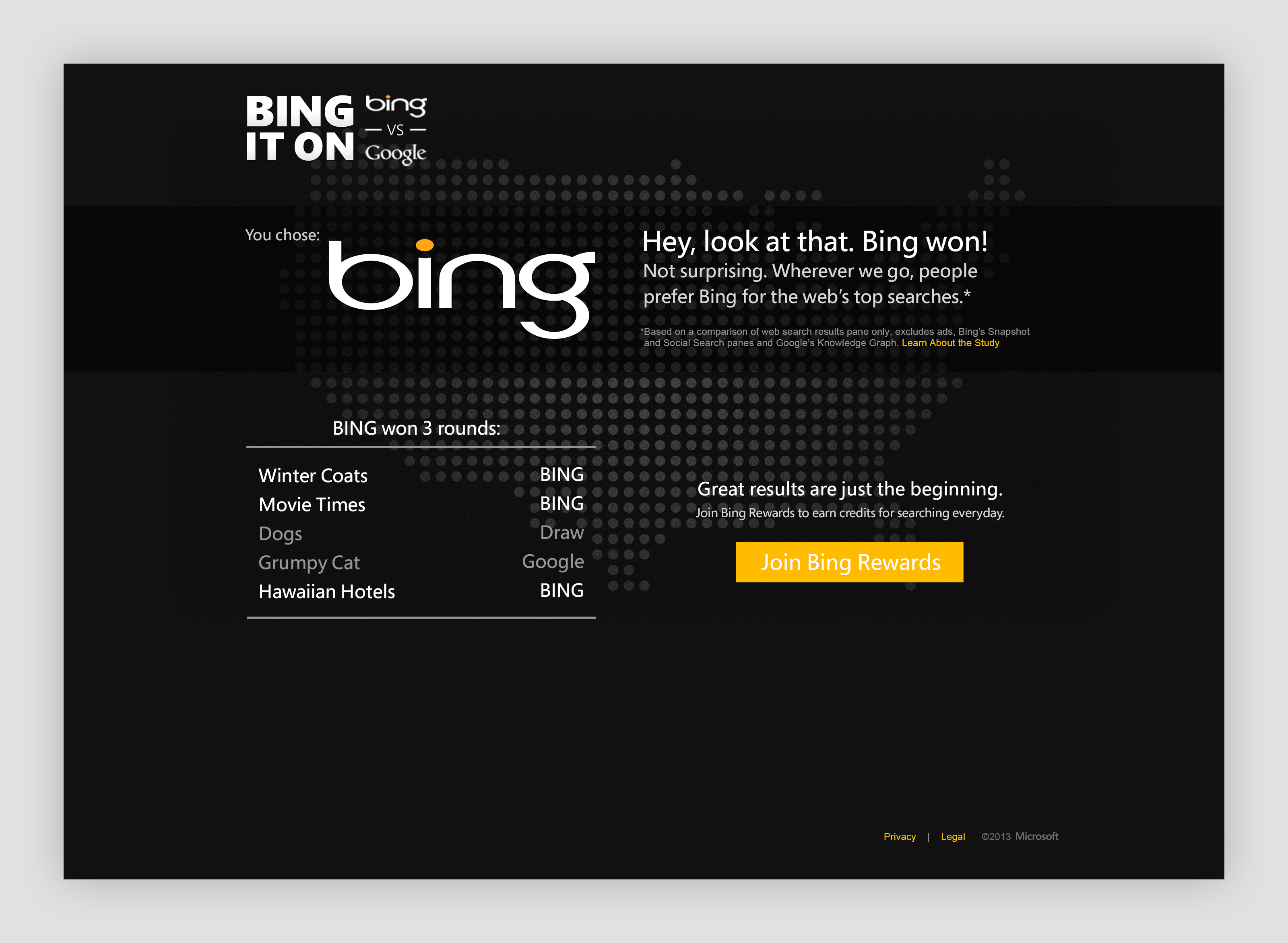
Overall the campaign was a success. Only intended to be a light hearted attempt at competing with Google the campaign brought many naysayers out of the woodwork. Independent and tech blog sites posted articles about the ins and out of the project which got even more people talking about the campaign and compelled to take the challenge. The tool drove additional impressions to Bing.com while offering a quick and easy experience to compare and contrast for the user. The project was enough of a success, later that year, Bing pushed the campaign into its British market.