UX & UI Design + Art Direction
UX & UI Design + Art Direction

My primary objective was to recommend best UX practices that the existing Access Investing website lacked to help solve the steep drop off of users trying to complete the on-boarding process. These benchmark insights would then help inform the client of what the pain-points were and help inform the redesign of the entire site.
The main challenge I faced was taking existing user testing data that was derived prior to me coming onto the project and contrasting that with the newest design trends and best practices in order to make my final recommendations. There was quite a bit of negative user testing feedback in regard to website functionality, so I was happy to put my visual design hat on as well to help give a wider breadth of insights to inform the future design.
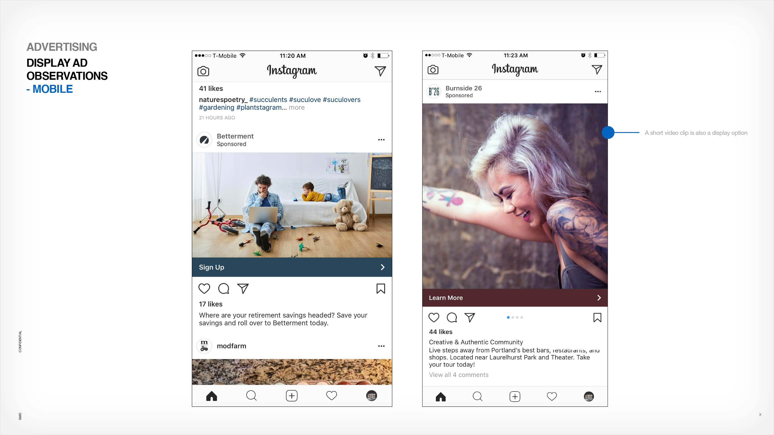
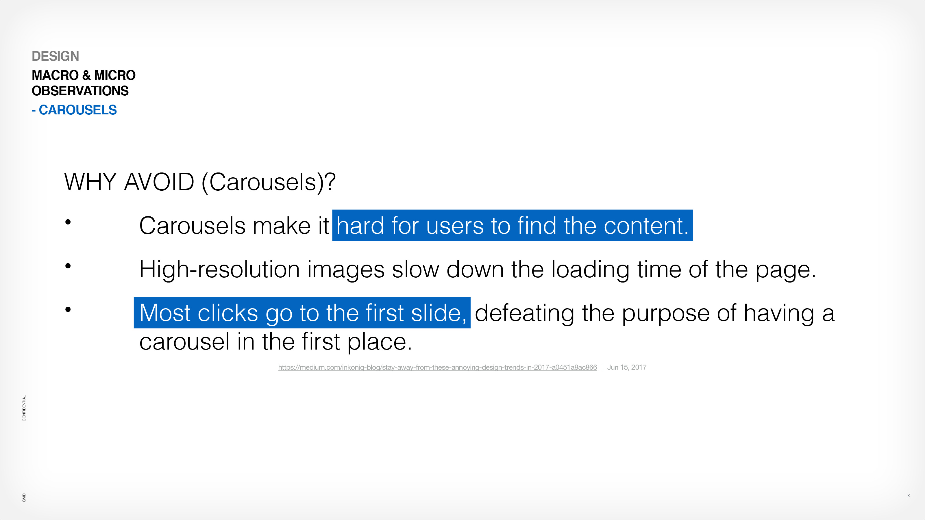
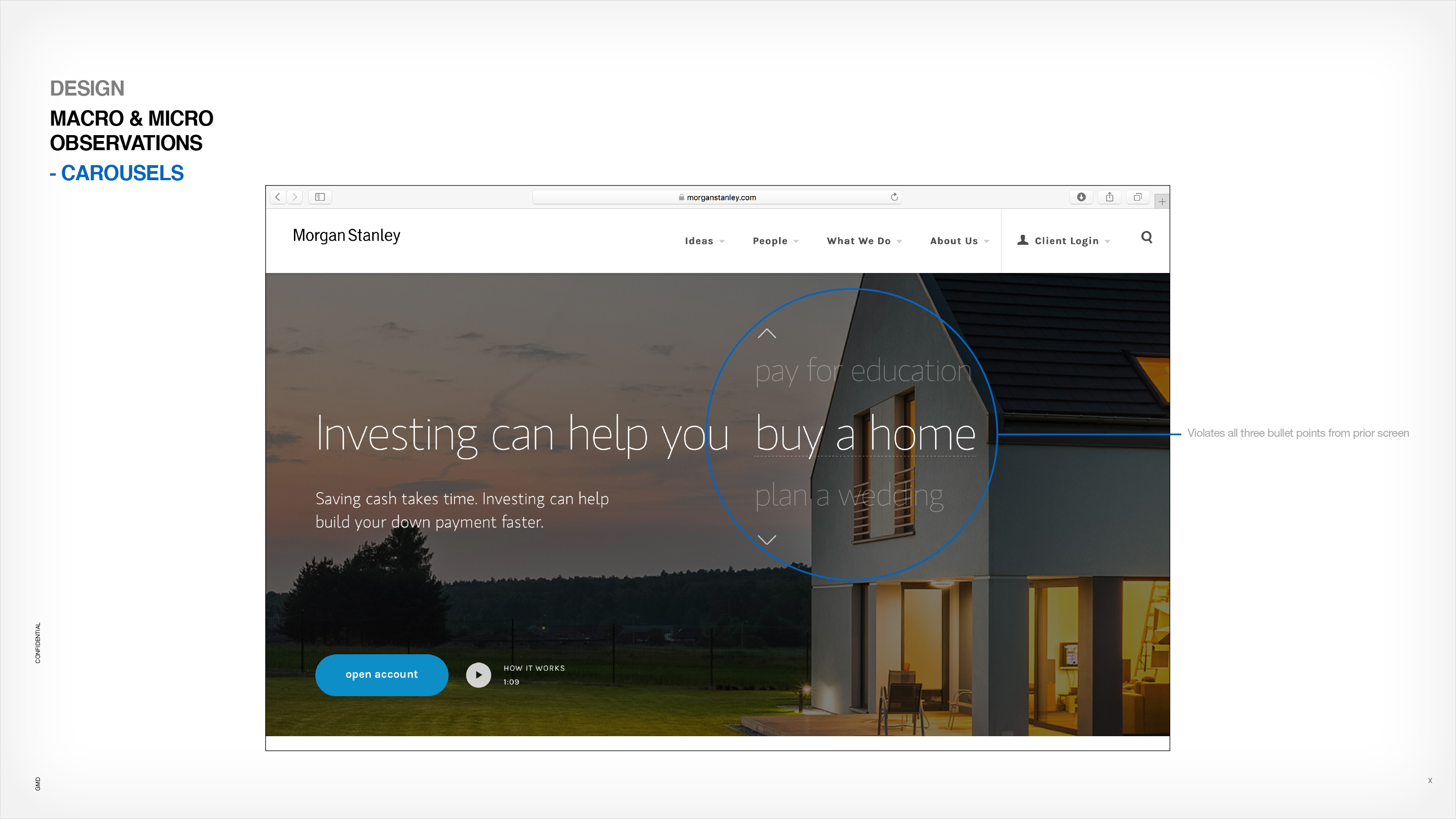
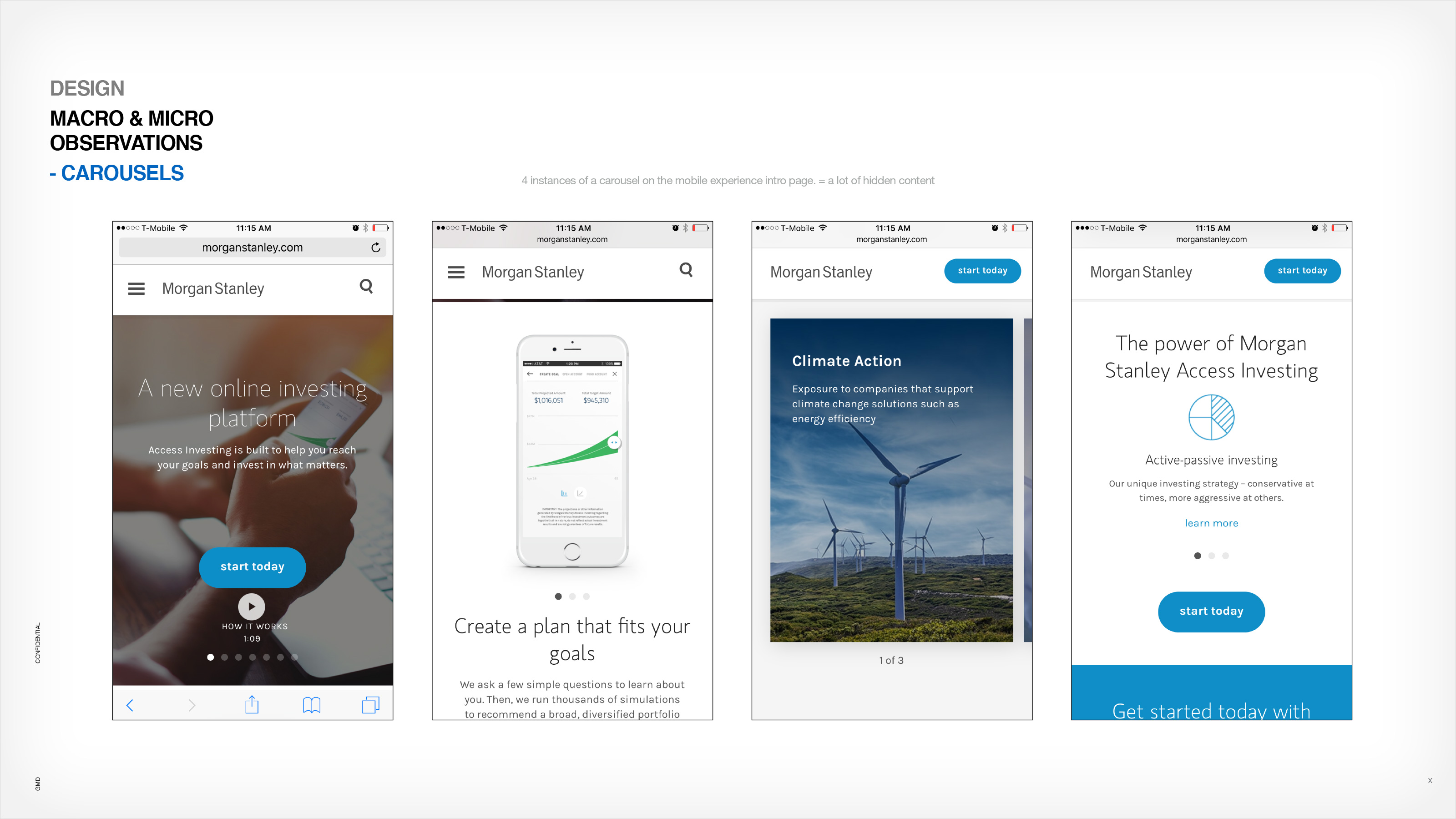
Since I already had a great source of user testing data to pull from, I focused on three main areas to improve the entire experience. Those focuses were on advertising, on-boarding and design best practices both UX and UI. After I completed my first round of findings, I made a 2nd pass on a few additional areas the client wanted deeper insight into. These included areas such as emphasizing a value proposition through graphical visualizations, estimating the growth of a potential customer’s portfolio over time before they commit to pay for the service, additional reasons to not use carousels (they were huge fans of them) and how to entice users to perform a deeper dive into investing into educational opportunities Morgan Stanley offered and the advice they would supply after the user committed to pay for the service.


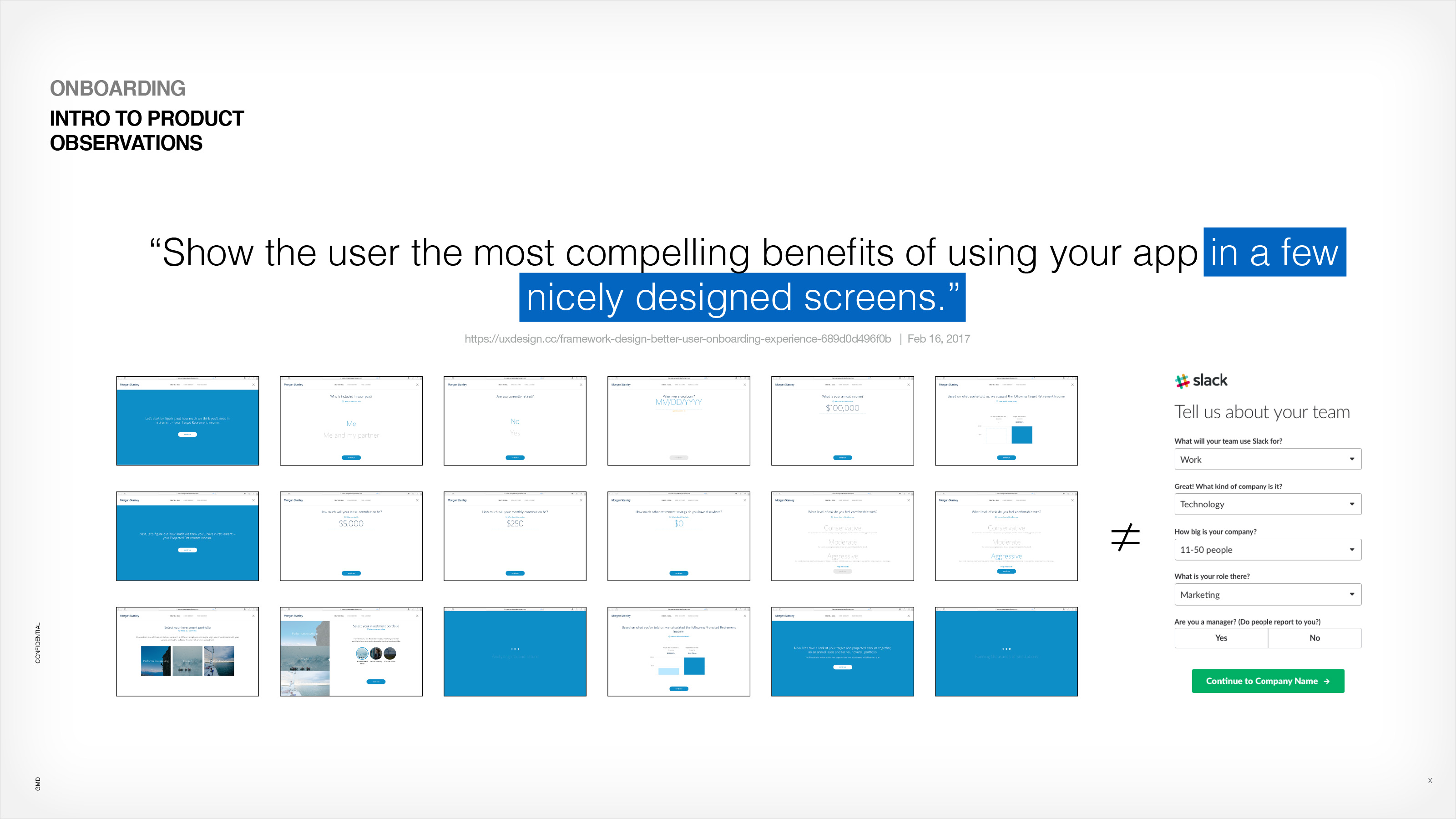

At the end of compiling my findings I put together a small prototype example to help illustrate what a quick intro to Access Investing might look like seen through the lens of on-boarding best practices. This was meant to give the user just enough enticing information, before buying, to feel like they could trust the service further. It covered off on the goal the user was planning on investing in, how much risk they wanted to allocate to their portfolio and then serving up a value proposition for user buy off. Based on what the user chose in that quick three step on-boarding intro a custom video was generated to build further user trust in the service. A quick, easy and valuable experience for the end-user.