I'm currently Vanport Brewing’s design and technology influencer and also their long-time drinking buddy. They trusted my professional advertising background for branding and marketing expertise and were very open minded about the user experience discovery and design process that I guided them through.
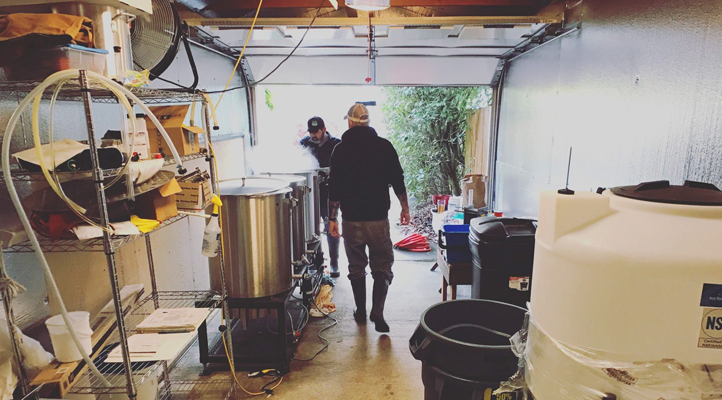
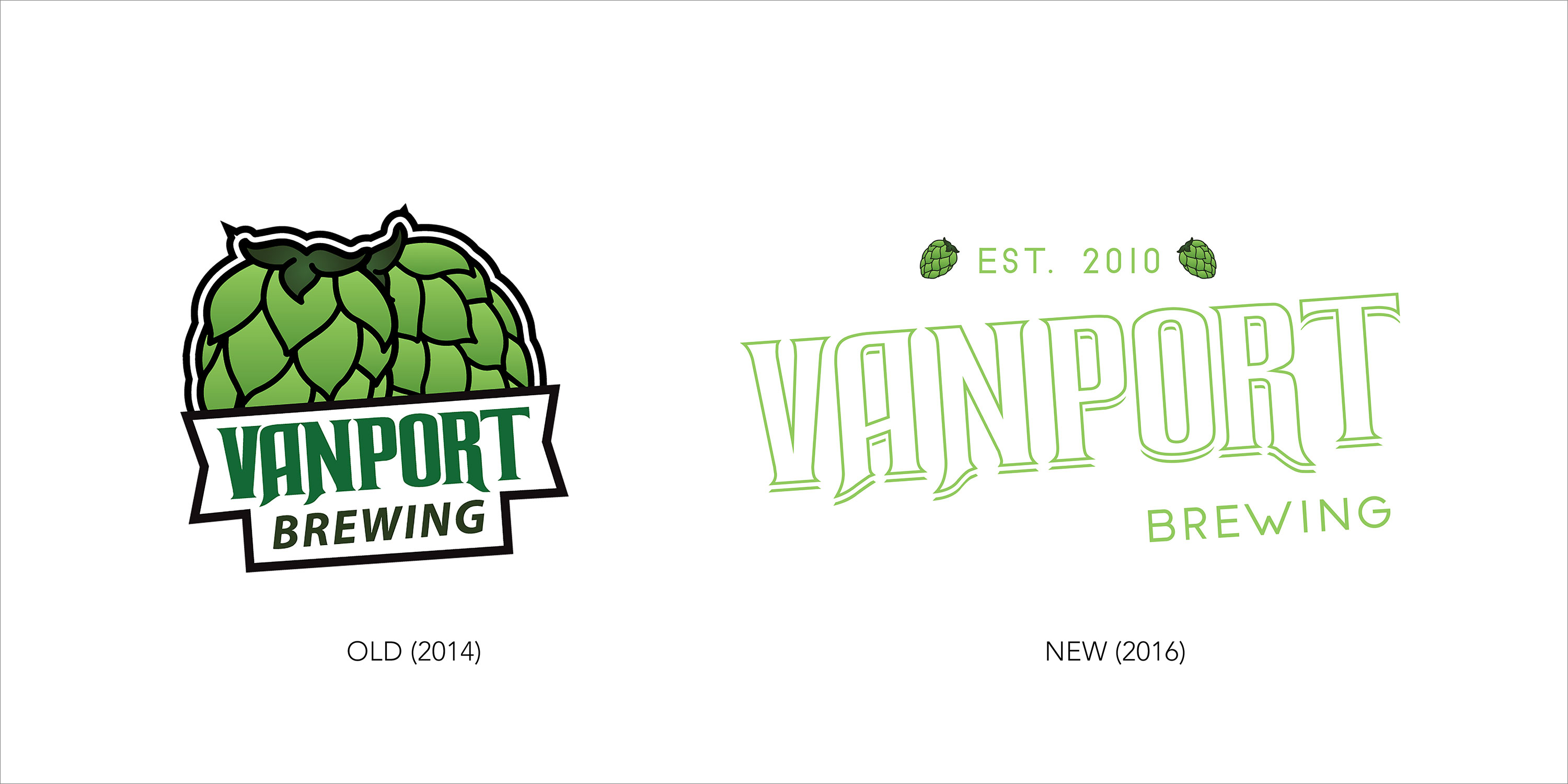
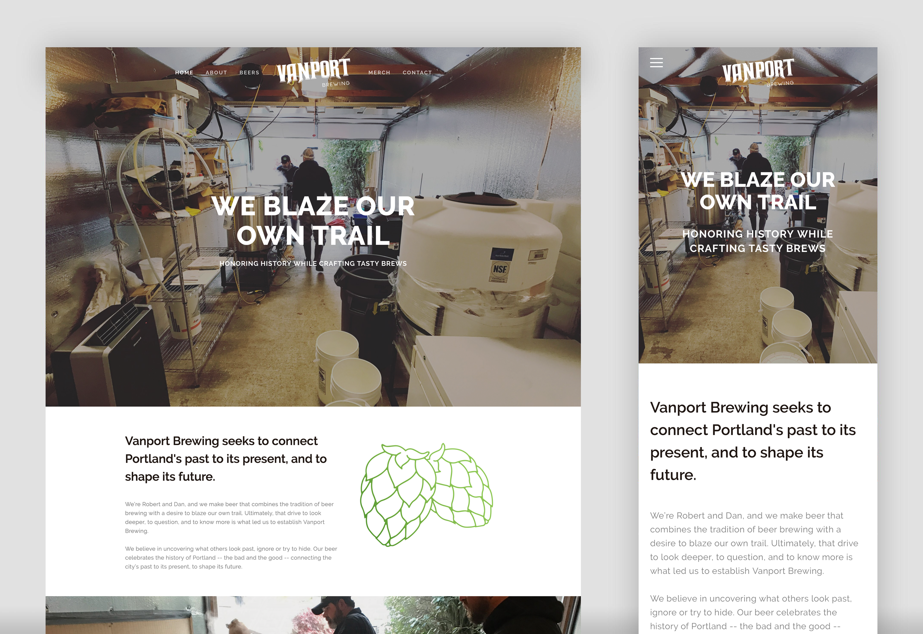
Established in 2010 Vanport Brewing is literally a garage-based brewery. Within the last couple years additional investors have been courted and are aggressively rooting for Vanport’s future success. I inherited a virtually clean slate to explore and create upon, with exception to a small social media presence and a handful of older design files that needed some finessing. After establishing an evolved form of their logo and beer can labels, we worked towards a website launch in early 2018. Vanport’s website acts as a public point of contact for potential customers and investors, houses the history of Vanport City and ethos of Vanport Brewing, while showcasing both their beers and merchandise respectfully.
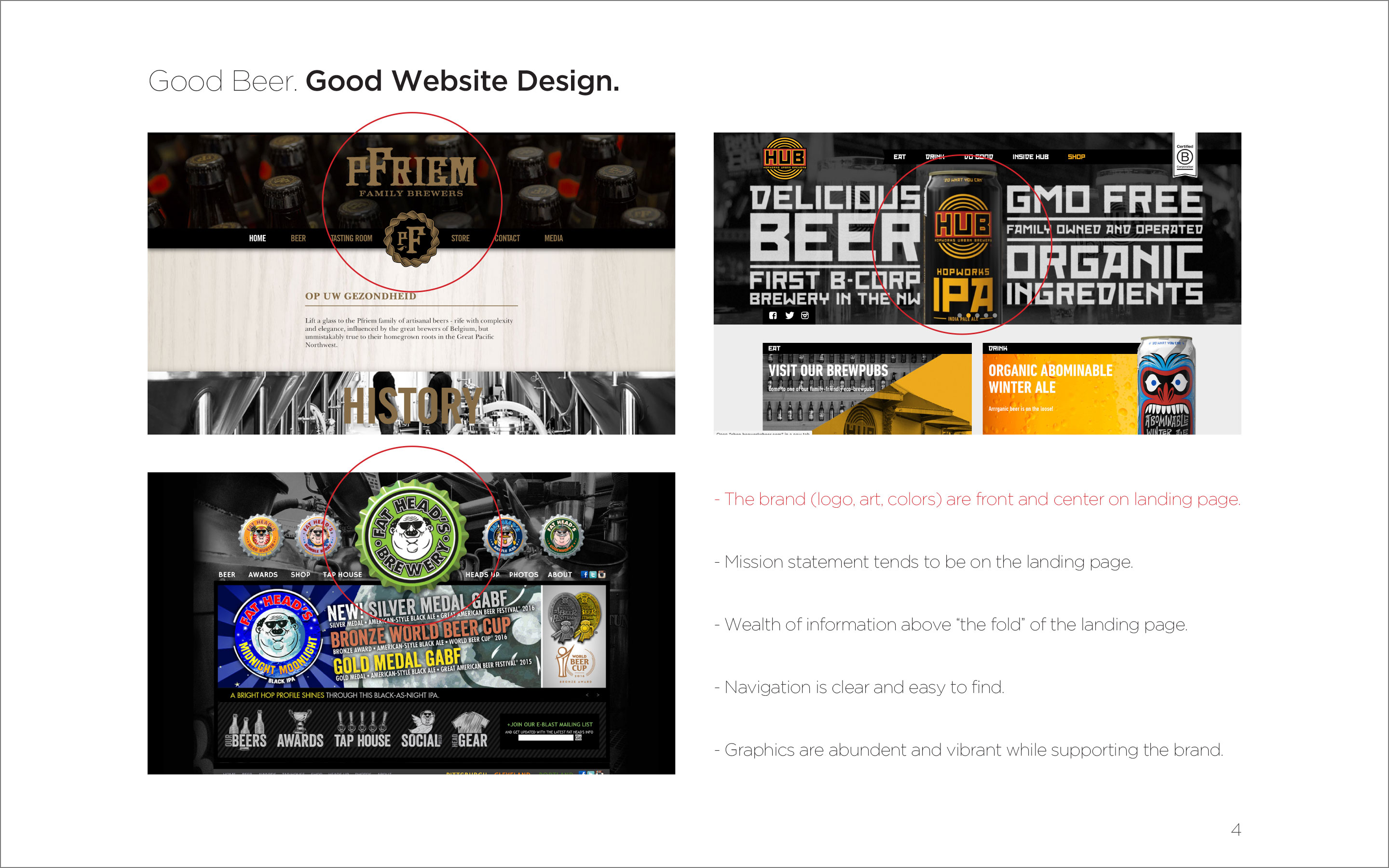
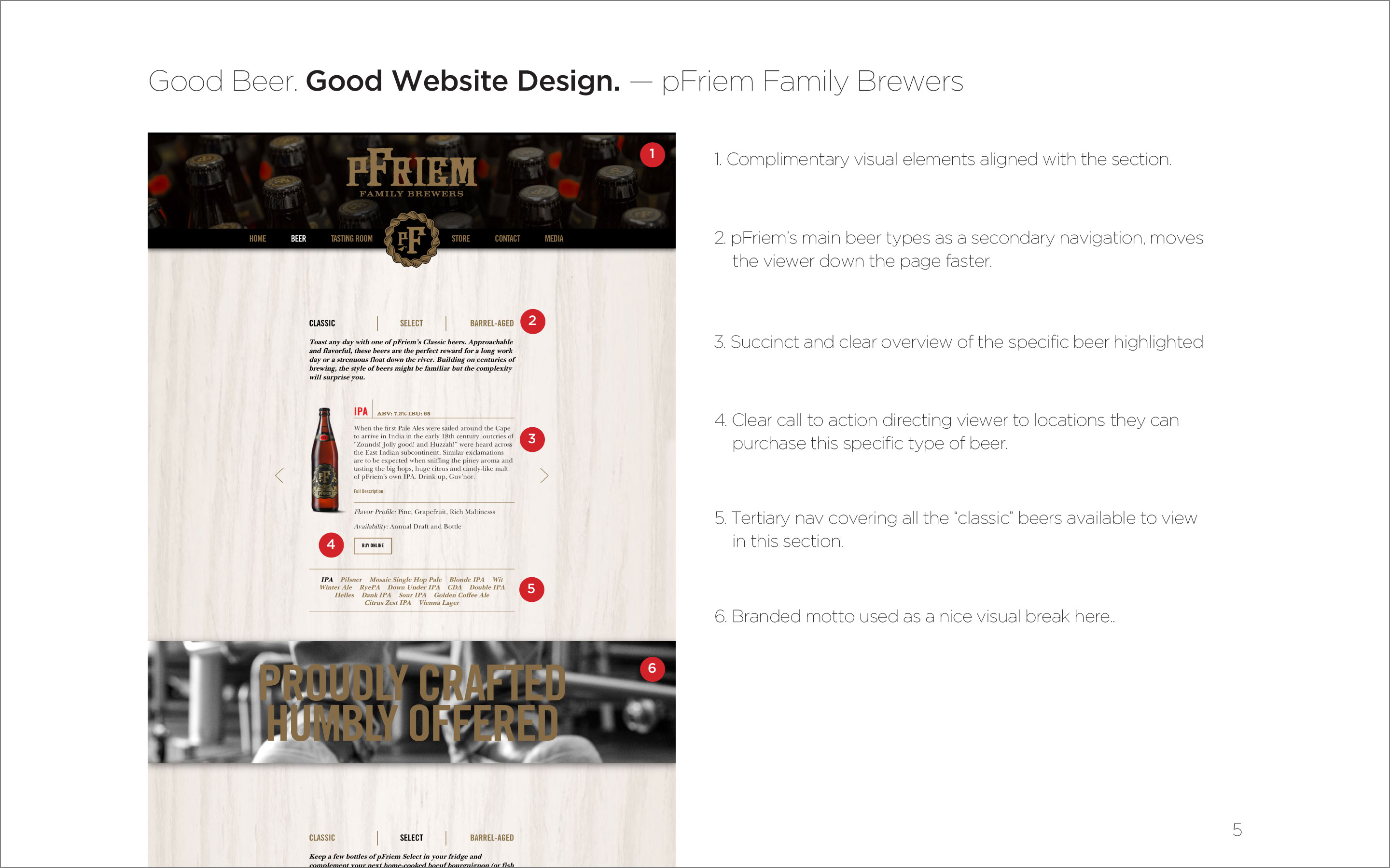
Utilizing my existing knowledge and enthusiasm for craft brewing I started this project with a head start of sorts, both in what makes a good beer as well as what a winning brewery brand looks and feels like. I put together a presentation for the co-founders called “Good beer, good website design. Good beer, bad website design.” Illustrating the stark differences in usability, information architecture and overall successful design applications of less successful as well as inspiring brewery websites.
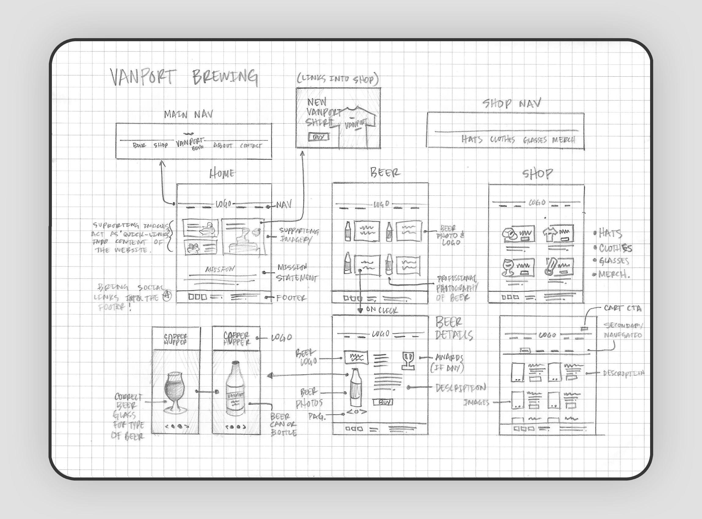
Based off of my earlier research on successful brewery websites, I crafted a site map with wireframes for each section that the co-founders felt were most important to include. Since they have a limited production capacity championing their tried and true beer recipes as well as their namesake’s history, along with merchandise that promote the brand, are key components of the website. Vanport city was one of the first multi-racial towns, which unfortunately was destroyed during a historic flood of 1948, so the historical significance was to be included in homage to the brand.
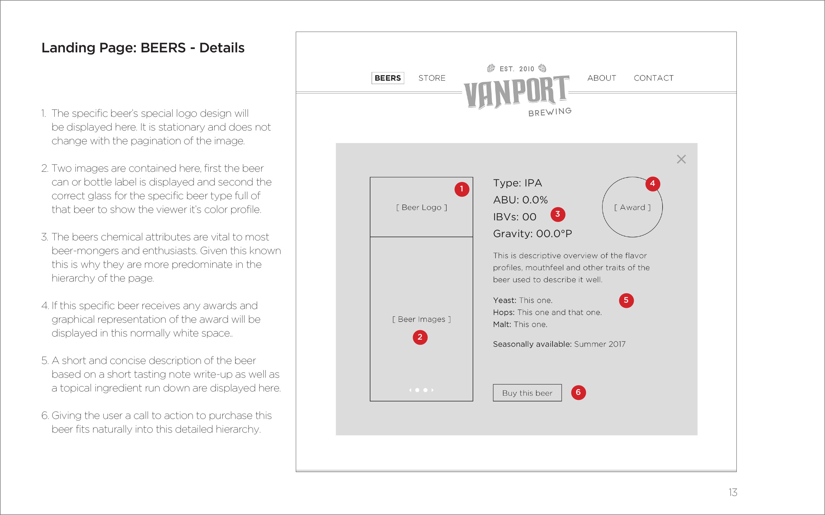
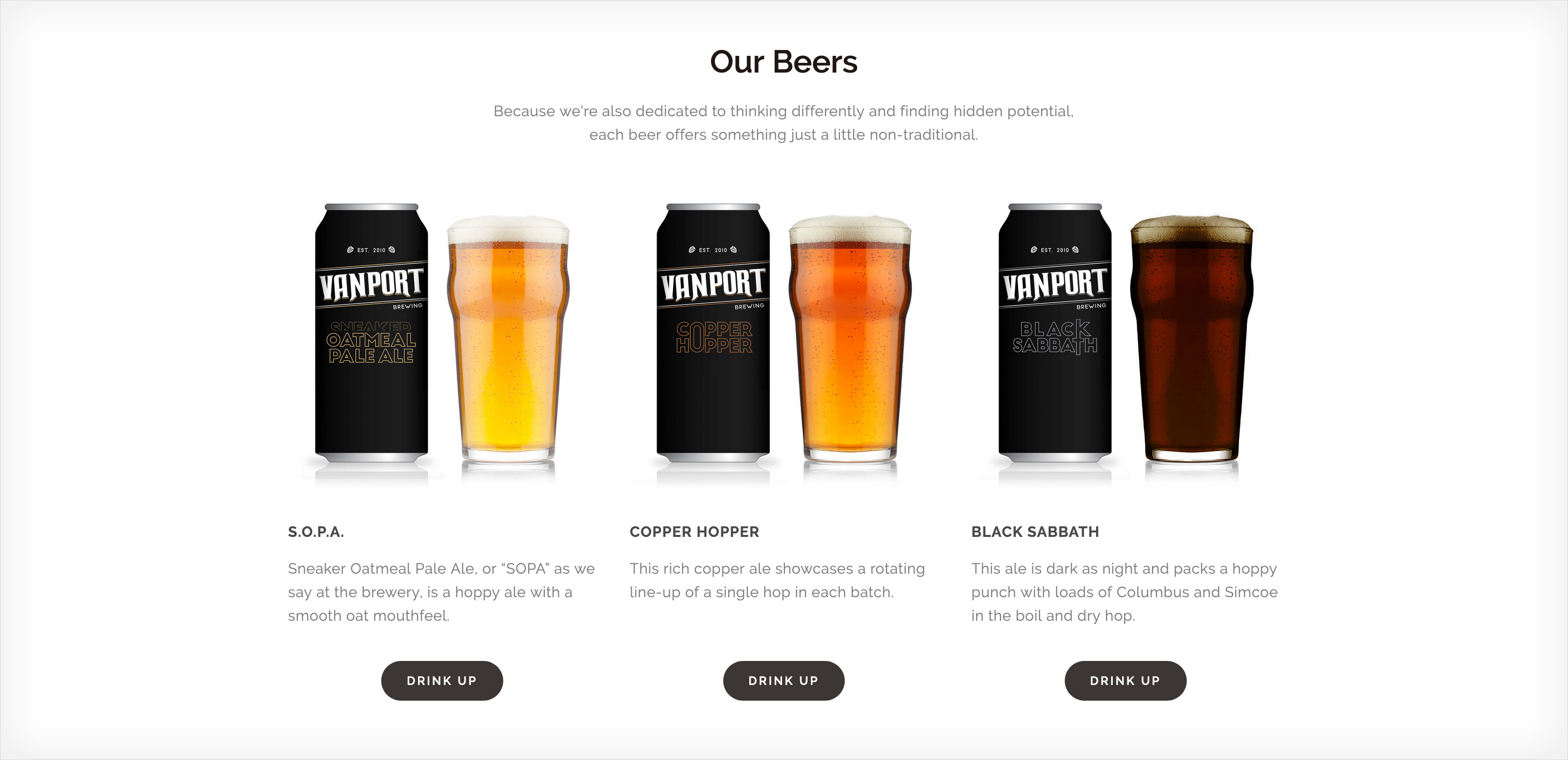
Regardless of the small budget I had to work with I was able to put together a modern website that met their needs for showcasing their new brand, their beers and available merchandise. Three distinct beers are still being canned in limited quantities for potential investors to enjoy. The owners wanted these brews to be differentiated from their normal branded green look, so I went with a “black label” inspiration for the design of the limited cans which focused more on the typographical layout to differentiate the three. I also established a new brand identity for their business cards, and social media accounts.
As part owner of the company and also its creative leader I have many projects in the works still to this day and creative iterations of the website are a normal part of this growing brand. Some of the valuable takeaways we learned through this process were centered around great breweries that fail at promoting their brand online and supplying enough easy to digest information about their beers for customers to be motivated to buy and get excited about the new brand. Vanport Brewing is growing, and their beer sales are up from last year which means their brand is continuing to carve a niche for itself in the local Nano Brewing community.